
January, 2018 - May, 2018
Shortly before graduting from UMich, I worked with small Ann Arbor startup called LookingBus to redesign the UX of their mobile app.
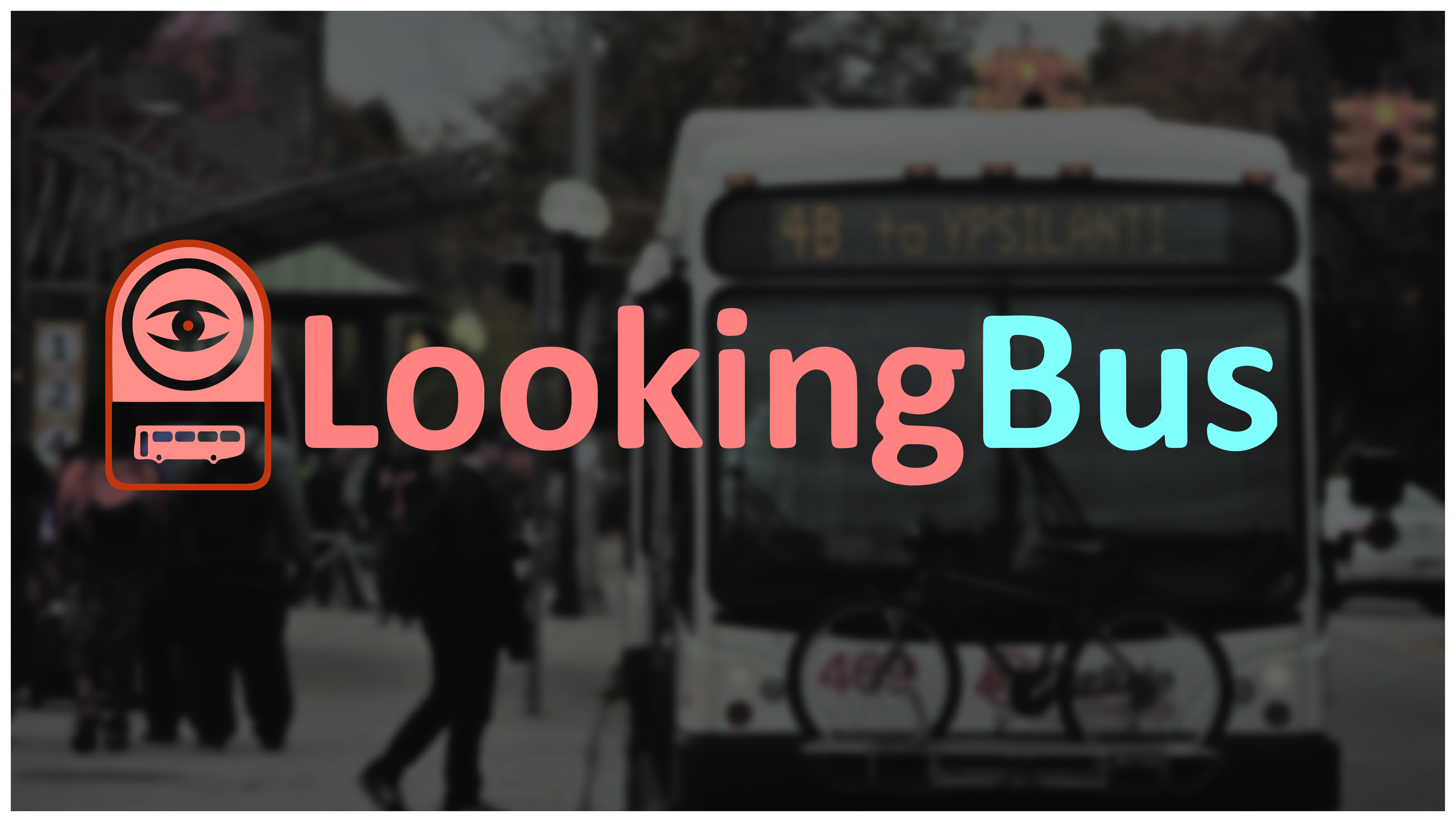
LookingBus' goal is to make public transportation more accessible to blind and visually impaired (BVI) users via their mobile app and propietary IOT technology.
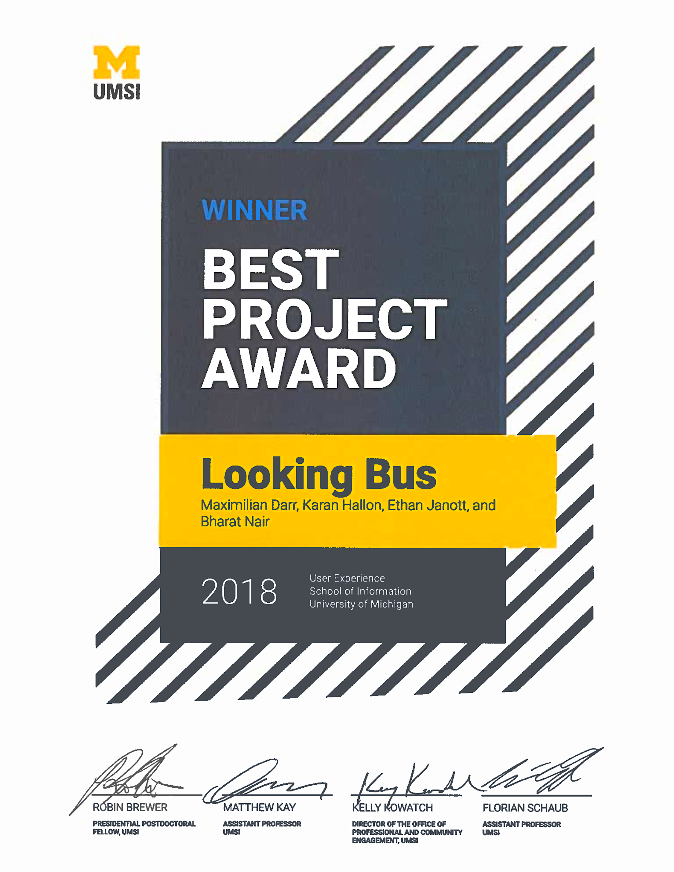
My colleagues and I submitted our work from this project to be judged in the 2018 School of Information Expo. The Univeristy of Michigan granted our team The Diversity, Equity, and Inclusion Award, and The Univeristy of Michigan School of Information Best UX Project Award 2018.
Most apps aren't designed for Blind and Visually-Impaired Users. They do not account for the unique set of a BVI user's visual limitations, behavior patterns, physical tendencies, mental models, information hierarchies, and screen reader usage. Thus, we strongly considered the BVI experience and perspective in designing the LookingBus User Experience. Every single element — from app navigation to route search, from ride booking and in-route information — was highly optimized for screen readers and the BVI User.
Our research included user interviews, literature review, heurestic evaluations, and competitive analysis.
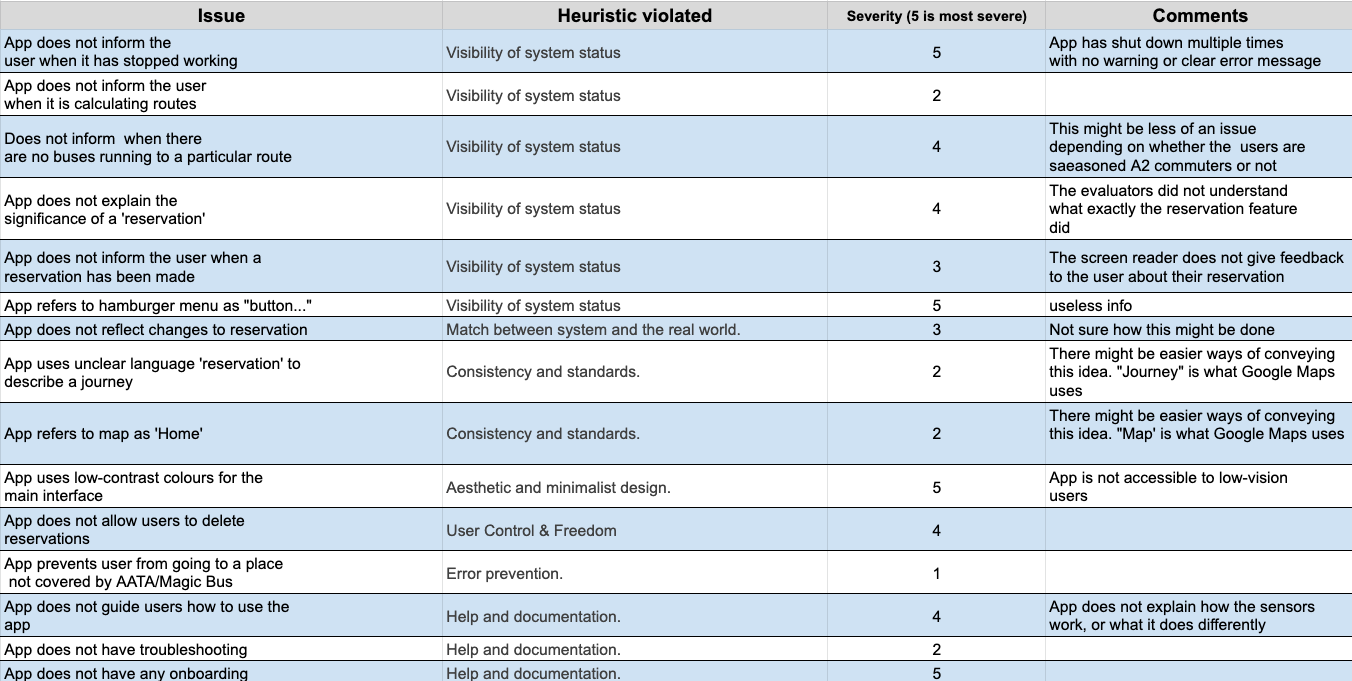
For our heuristic evaluation, we had multiple sessions using screen readers with Android, the then-version of the LookingBus app, and various other mobile apps. We also adapted certain Nielsen-Norman metrics for the context of the screen readers and the BVI user. To see the full Heuristic Evaluation matrix, click or tap the image below.
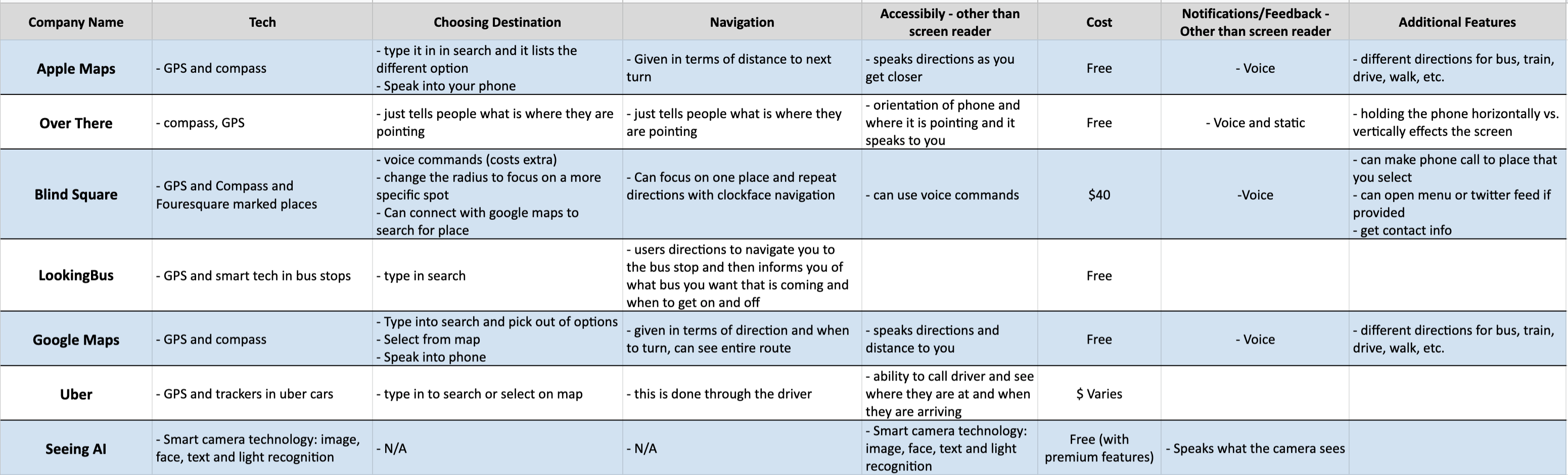
For our competitive analysis, we looked at a variety of digital products, each with their own interesting design approach with regards to either transportation or BVI users. Some mobile apps that we considered included Google Maps, Uber, SeeingAI, BlindSquare, et cetera. To see the full competitive matrix, click or tap the image below.
Below are the citations for the literature that I read to gain more background on accesbility, relating specifically to BVI app development:
We made sure to cover native accessability feature integration into personal devices, as well as how 3rd-party developers address the issue.
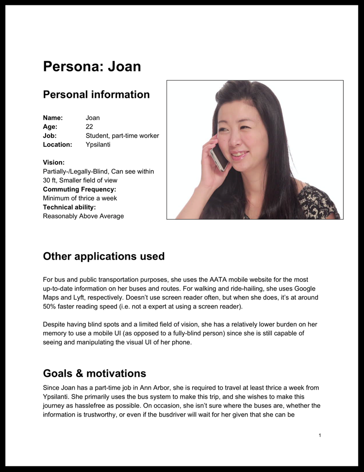
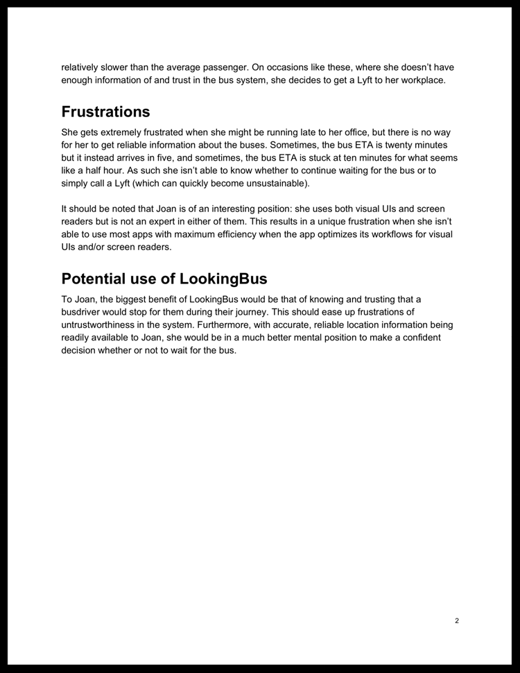
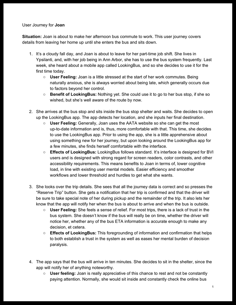
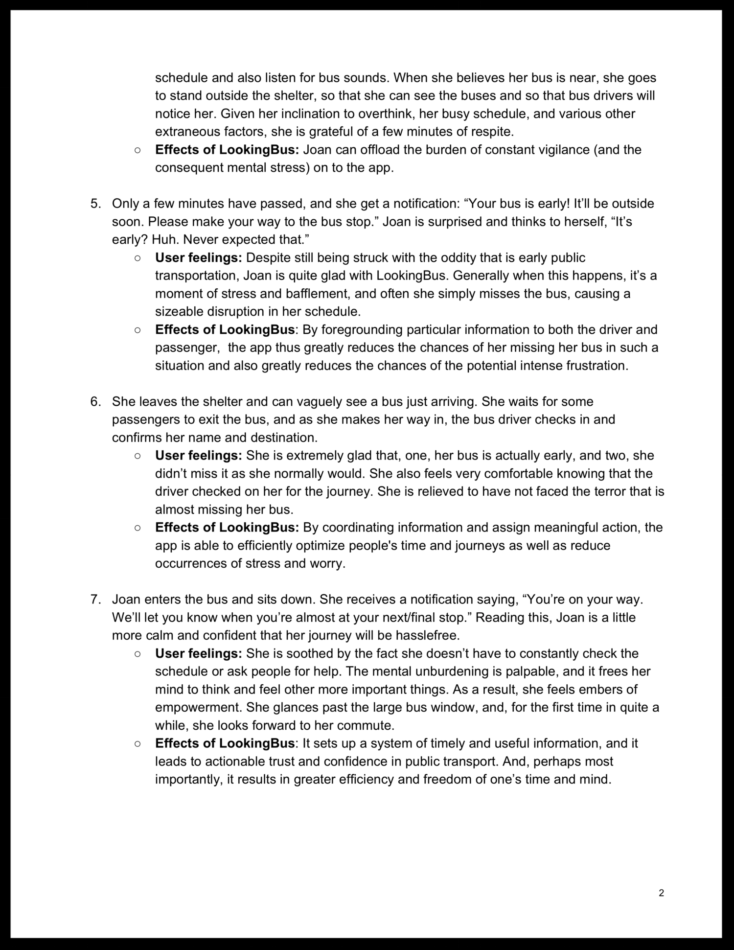
Based on our interviews and research, we had three primary personas, each with a discrete and particular level of vision: fully blind, mostly blind, and partially blind. Each personas had their own different levels of vision and, thus, their own unique considerations. Below is the example of Joan, our persona that portrays a partially-blind woman.
Tapping any of the slides below will open Joan's full persona and user journey.
From our extensive research and understanding, we created three sets of design requirements for our User Experience. They were as follows:
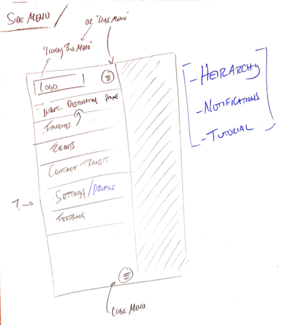
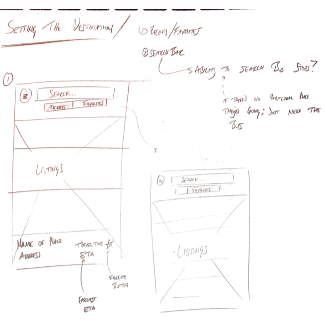
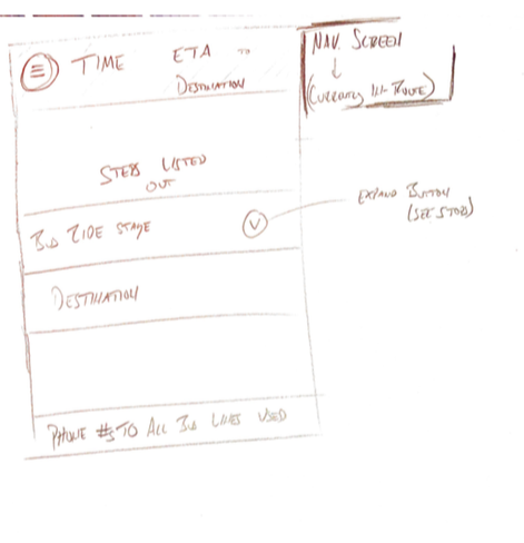
With all the research and requirements in mind, my team and I set out to create the UX for the LookingBus Android App. We moved from initial rough sketchs to lo-fi wireframes created in Figma.
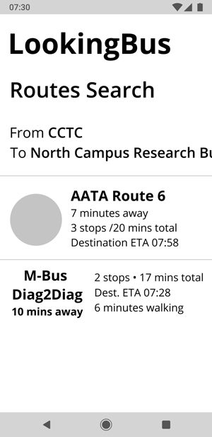
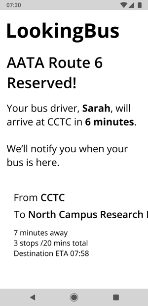
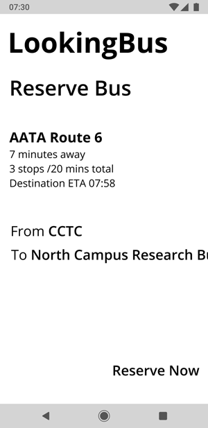
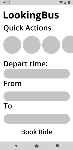
At this point of the project, we moved onto creating our first version of our design prototype. Here we implemented all meaningful and intended visual elements and interactions behaviors. Given my familiarity with Figma, I was the primary creator of most of our final prototype content.
Below is prototype was created in Figma. I recommend expanding to full-screen for detailed viewing.
We had a very positive response to our first prototype alongwith some great feedback. However, we ran into a problem: how would we test and validate our prototype and our assumptions? In it's first version, while it considers how screen readers work and how BVI users analyze information, it was purely visual since Figma prototypes aren't compatible with a screen reader. It was a complex problem that we needed to find a solution to for testing.
I came up with the solution that we could export screens from Figma, and then, using my general HTML knowledge at the time, create clickable hot spots on the PNG images with "alt" tags (so that they would work with a screenreader). We exported the Figma screens onto an HTML file, and then we image-mapped every relevant UI element. I then hosted the pages on my site, and voilà, our UI was successfully compatible with a screen reader.
Below is a video of our prototype working with a native iPhone screen reader:
You can view and interact with our final mobile prototype here (see note blow):
LookingBus HTML Prototype
NOTE: This prototype is meant to be viewed in a mobile browser with the mobile device's screenreader turned on.
On iPhone, you can turn your screenreader on by going to Settings > General > Accessability > VoiceOver (ON). You can view the prototype without the screenreader, although you'll lack the full experience!
Our visual design spec was thoroughly considered, and it was crafted with care and patience. I took the lead in the ideation, designing, and execution of this and the other two design documents. A bulleted list of the visual design specifications can found below.
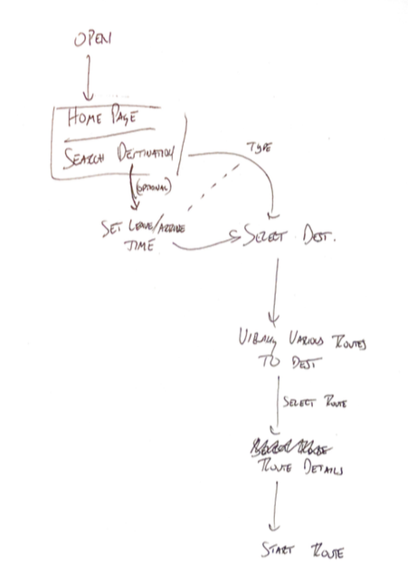
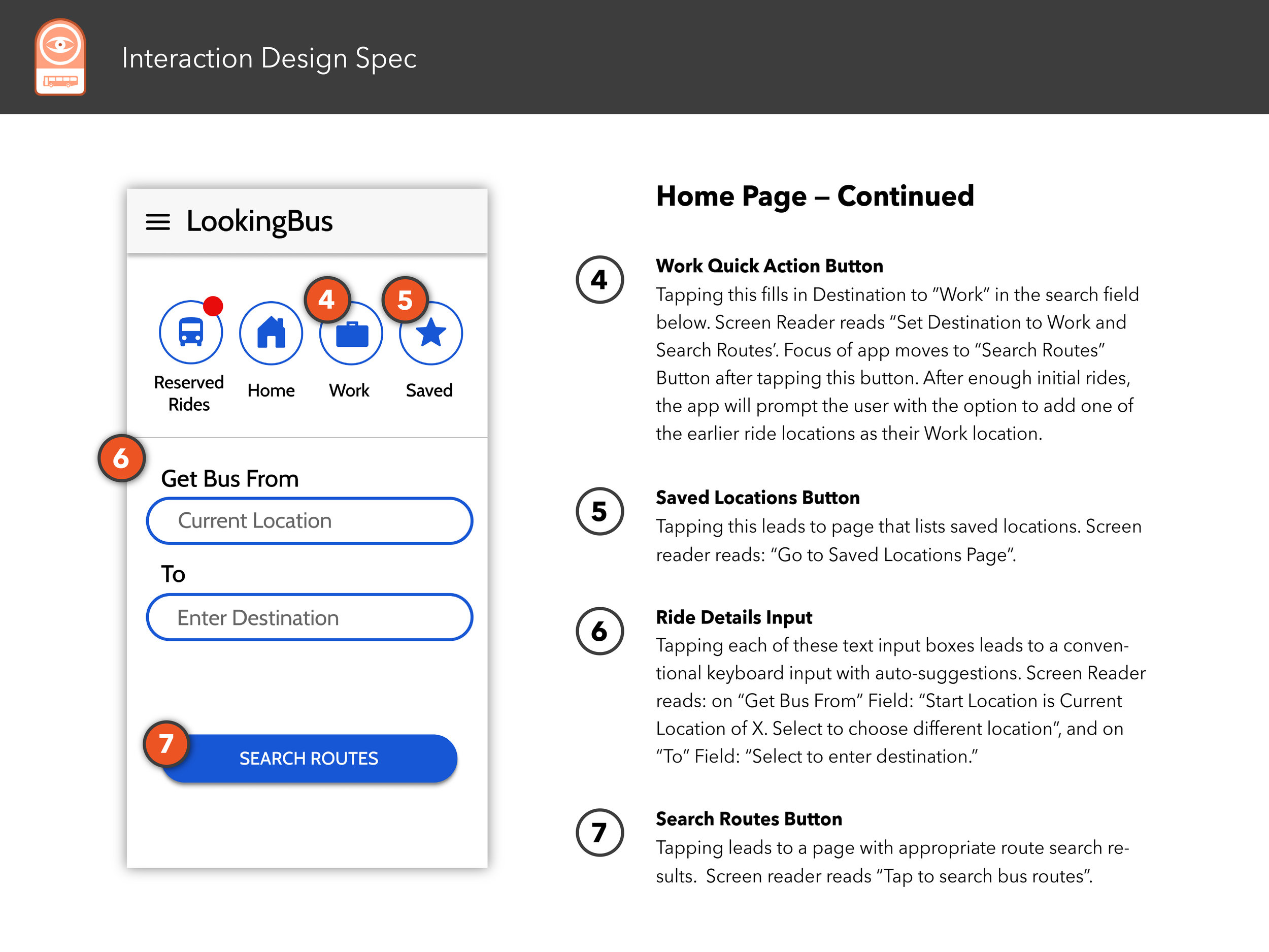
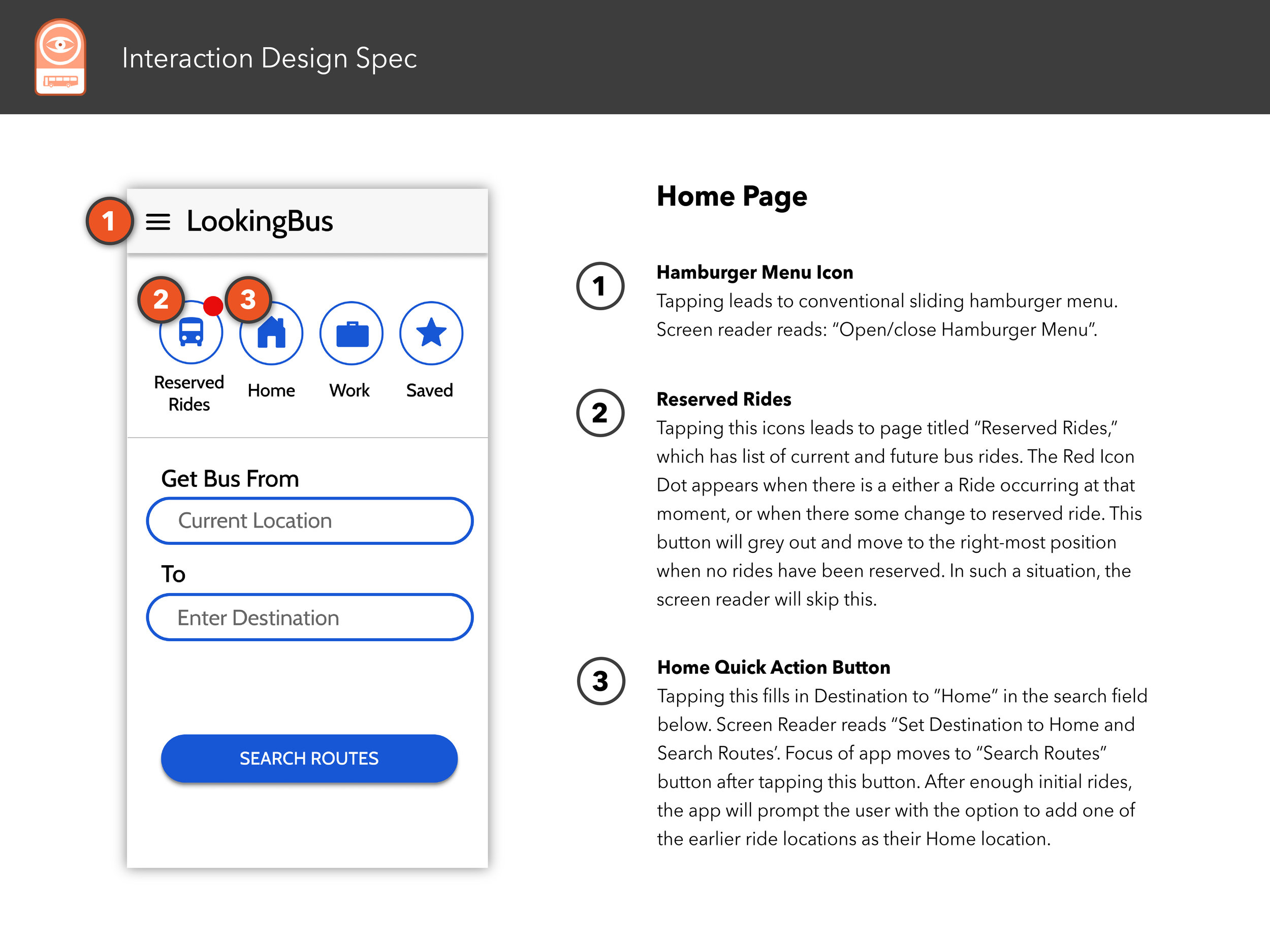
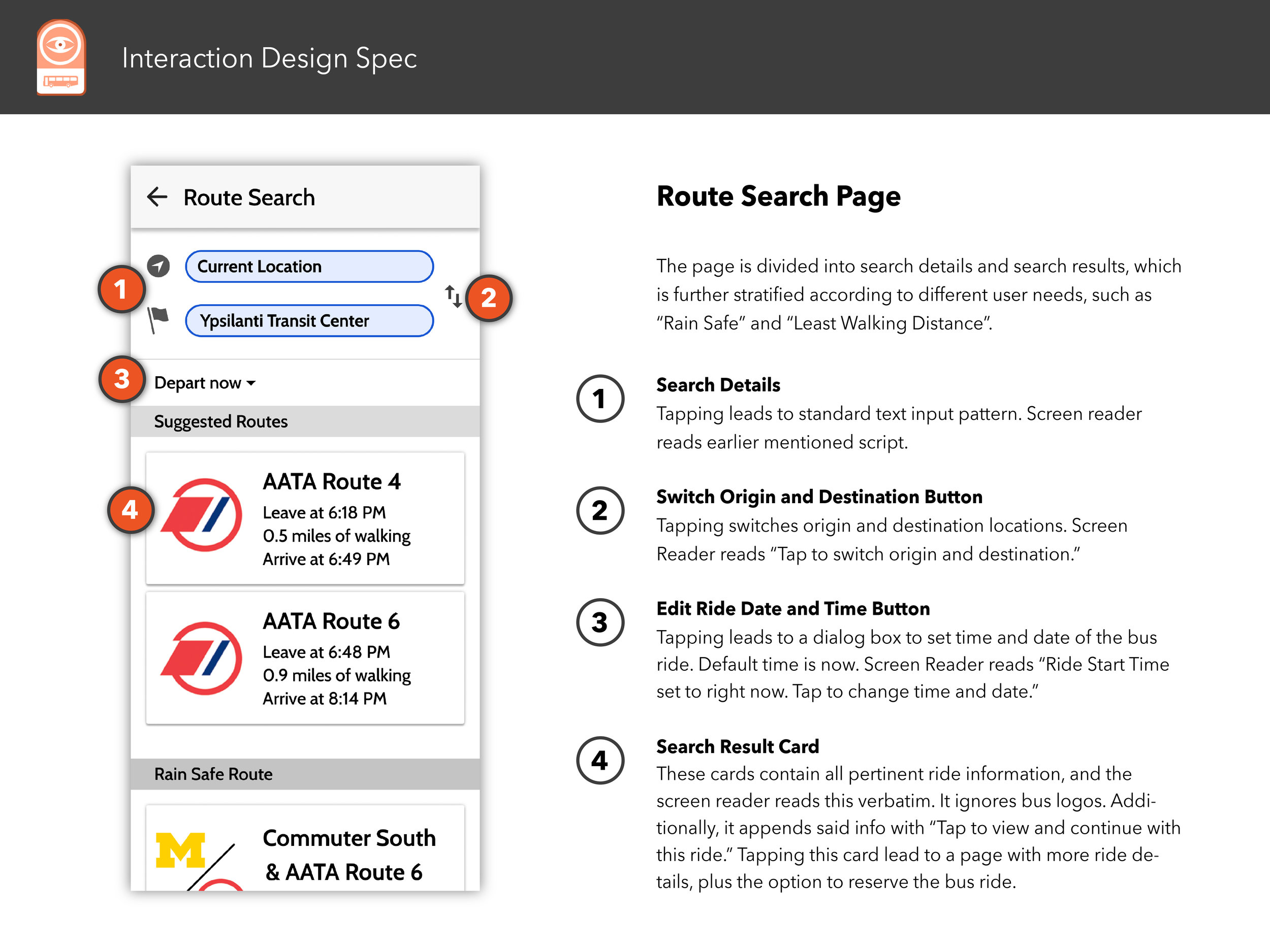
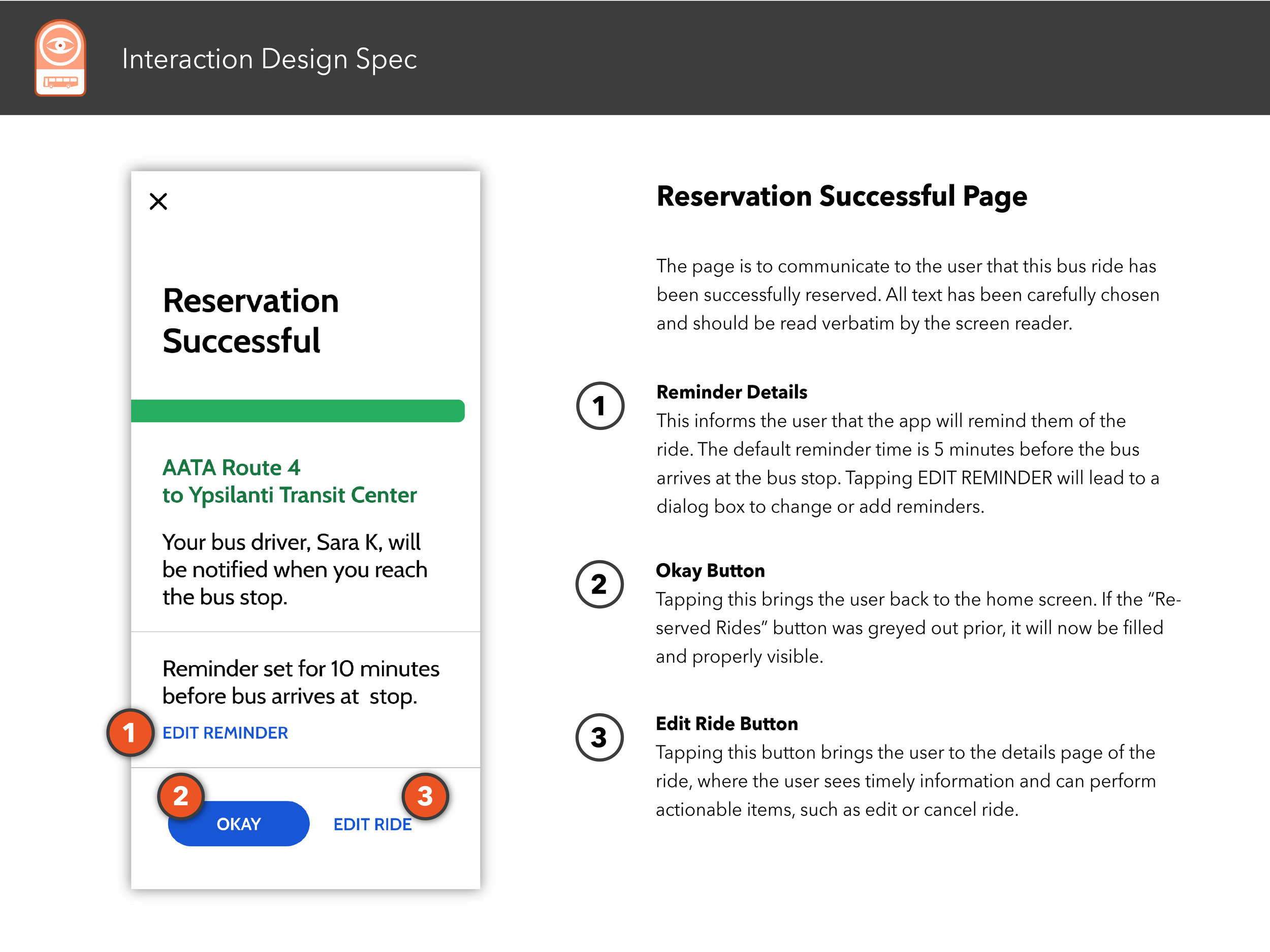
One of our deliverable documents for our client was an interaction map that details two main processes within the LookingBus app: reserving a bus ride, and in-route ride details.
Tap or click the image below to view both interaction maps in full.
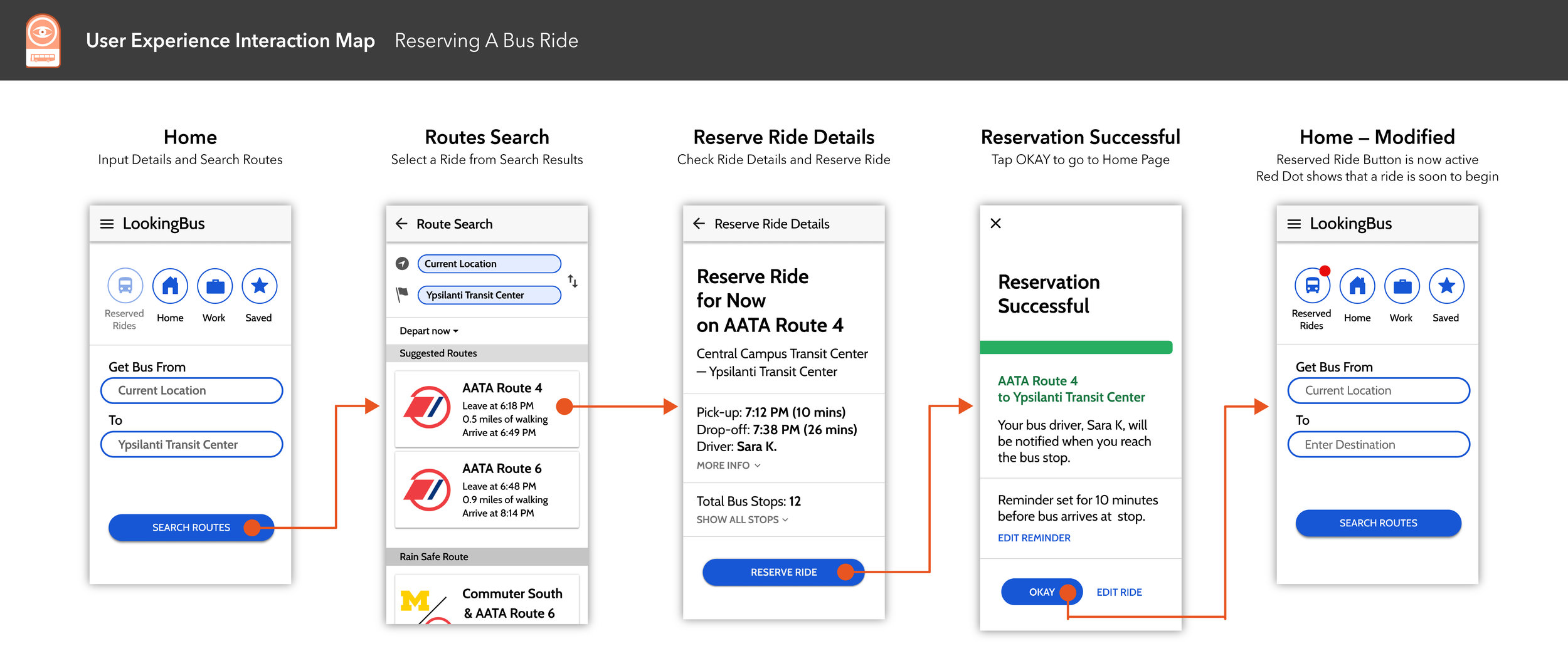
The following pages showcases a well-considered and professionally-rendered design document that details every meaningful interaction between the UI and user and screen reader.
Select any image below to open the full Interaction Design Spec document.
For me, this project was a huge successs. It was my first time fully immersing myself into a UX project where success was determined by stakeholder satisfaction rather than a grade. I challenged myself by chosing to do a project that was centered around accessability for blind and visually impaired users, something that I had zero exposure to prior to this. It was a excellent combination of complexity, analysis, creativity, and problem solving.
This is undoubtedly one of the most meaningful UX projects that I have had the pleasure of working on thus far in my career.